We created a brand system for a new restaurant from scratch. Here’s how.
We were challenged to develop the brand for a new veggie-friendly, modern BBQ restaurant in Austin, TX. While the project was originally conceived as logo design plus some marketing collateral, the scope of the undertaking expanded considerably during the discovery phase.
A brand is more than a logo; it’s the comprehensive sum of an entity’s presence and presentation. Taking that wide-angle view, we determined that this restaurant needed a brand strategy that started right at the start: positioning to messaging, naming to logo design, collateral design to brand activation. Establishing a unified, intentional brand would ensure the client was:
Clear on brand audience, positioning, and messaging
Consistent with communication across channels
Cohesive in presenting the brand visually
To do so, we employed our 5-part branding methodology, developed to ensure a feedback loop between all facets of the brand. Our methodology comprises:
Brand Positioning
To ensure that all marketing materials and messaging are coming from a place of unified strategy and planning, the first step of this project was to establish the restaurant’s brand positioning. Through brand positioning we surfaced the audience, messaging, brand voice, and initial brand direction. Positioning is the foundation of every subsequent decision made for any brand.
We distilled our research to extract invaluable insights, and landed on a theme we could build on in subsequent phases of brand development. To share our findings, we put together and presented a deck that highlighted our findings to be used as a reference for internal stakeholders moving forward. You can follow along step-by-step to see our process for brand positioning here.
We discovered through this process that the theme for the restaurant would be “Eclectic Farmhouse” and its brand voice would be responsible and educational, while still being welcoming and hospitable.
With positioning established, we moved on to the next step, where we use our methodology to find the right name for the brand.
Brand Naming Strategy
After positioning was complete, we used the brand facts established in that phase to conduct a naming study. In this study, we dug deeper into our positioning findings to research names that expressed the fledgling brand. Our naming study also weighed practical dimensions of a brand name, such as available URLs, how memorable it is, its likelihood of getting a trademark, etc.
At this point we shared our findings in the form of a naming deck, presenting several potential directions for the restaurant name. In this case, three finalists were selected from our study to undergo legal vetting. The final name: The Fence Post—chosen for bringing to mind southern fields, livestock, and agriculture. This choice connects to the farm-to-table aspirations of the restaurant, conjuring impressions of sturdiness, reliability, and trust. These evocations aligned with our findings from the positioning phase and core tenets of the developing brand.
Brand positioning and brand naming are the two core components of what we call “Verbal Identity”, the guidelines for expressing a brand in written form. The next step in our process, as you might imagine, is to develop the visual component of the brand.
Identity System Development
Building on the two previous steps, at this stage we typically have enough insight and information to begin creating the identity system. This is the framework for expressing the brand visually, developed to bring rigor and consistency to a wide variety of use cases.
The logo is often the first touchpoint people see when absorbing a brand, and needs to consistently evoke the same brand essence that’s been carefully curated between positioning and naming. Additionally, it’s important to create a system that has the flexibility to scale to any deliverable while maintaining readability and recognition; it is at this intersection that brand equity is created.
We presented unique, custom logo options in black and white for The Fence Post—with the positioning and final name choice in mind—to create a foundation upon which the identity could be expanded.
From there, four options were selected for further refinement, and we introduced colorways that aesthetically matched each finalist, each being interpretations of the “Eclectic Farmhouse” aesthetic.
Ultimately, the winner was a cast iron skillet, alluding to the comforts of down-home cooking, paying homage to the vessel in which the cherished sides of barbecue are made, and creating separation from the meat-first association of barbecue. This logo offers a huge range of flexibility in usage, working equally well as a sign with included text or on its own as an icon. It scales up and down in size and is effective up close or at a distance.
Once the final identity was selected, we continued refining the colorway until we landed on our final palette and logo, and were able to deliver a logo suite for the primary and secondary systems. The primary logo is to be used whenever possible as the preferred identity; the secondary logo options were devised to add flexibility to the system and create alternate lockups for activations or collateral where the primary logo doesn’t work.
Having established both the verbal and visual components of the brand, our next step is to document them in a brand guide—essentially, a user guide for the brand.
Documenting the Identity System and Brand Rules with a Brand Guide
With the logo development complete, the next phase of the project was to develop the brand guide. This is when the pieces of the puzzle come together in a document that explains the rules of the brand, and creates the benchmark standard for the visual and verbal identity to ensure brand consistency.
When done right, the brand guide informs any and all branded content, and provides rules to make sure all content stays consistent, promoting brand equity and recognition.
For The Fence Post, our primary focus was to communicate our findings holistically and create a document that could be shared internally and externally so that all outward communication visually and verbally reflected The Fence Post’s unique value proposition. In the end, we created a document that:
Defines usage rules for the logo
Homes in on messaging pillars
Finalizes brand voice
Codifies photography guidelines
Establishes the brand palette
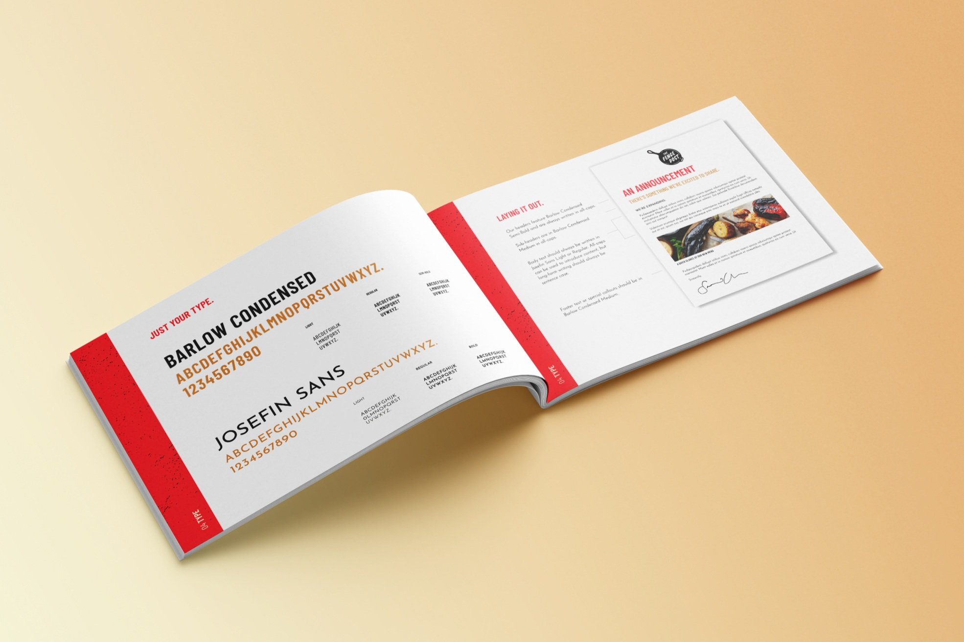
Organizes typography and layout principles
The final step in our branding methodology is to take the identity system elements documented in the brand guide and “activate”, or apply them, to real world use cases.
Activating the Brand with Collateral, a Website, and Social Media
The brand guide is, in a way, the theory of a brand. That is, it’s a document that collects all of the ideas that make up a brand:
Why the brand exists and who it exists for
How the brand/brand promise is communicated
What the brand does
With this guide in hand, however, a brand is ready for activation, where theory becomes reality. Most often, brand activation happens through branded collateral and communication channels. For The Fence Post, we activated the brand in 3 primary ways:
A collateral package
A website
Social media
The Collateral Package
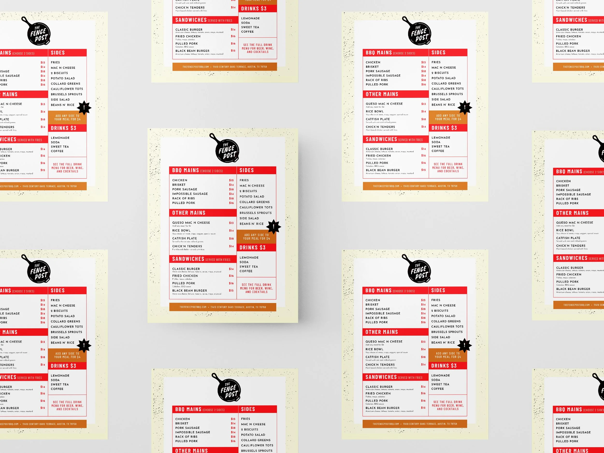
The collateral package took the elements of the brand (logo, color palette, font) and applied them to real-world, tangible goods. We started with the menu, retaining the “Eclectic Farmhouse” vibe and established brand colors to ensure a coherent dining experience. We designed exterior and interior signage, leveraging the simple elegance of the brand font and colors as a reinforcing identity element.
We also explored package design for the house BBQ sauce as well as to-go containers. Having consistent branding across these common touch points ensures a cohesive, pleasing, and trustworthy user experience.
Brand activation was extended to The Fence Post merchandise, including T-shirts, hats, and tote bags. This enables fans to stay connected to the brand outside of the dining experience, building brand equity and loyalty.
The Website
Using the identity system we had developed, we built a website for The Fence Post that expressed both their verbal and visual identity. Keeping copy short and sweet, we used this opportunity to reinforce the restaurant’s mission and unique value proposition. The bulk of site real estate was given to mouth-watering photos of the meats and veggies, keeping the product as the star of the show.
Social Media
Further expanding brand activation into the online world, we used Instagram to showcase tantalizing images of The Fence Post menu offerings. As an accompaniment, we used the brand messaging guidelines to help shape the post copy, projecting the brand’s friendly and youthful vibe.
Click to read some sample posts:
Conclusion
Branding projects are a huge undertaking—we saw for ourselves when we took our own medicine and rebranded our website. What we’ve found time and time again is the attention to detail and iterative nature of the process are essential to communicating a brand in a consistent and cohesive way. For The Fence Post, when everything was said and done, the volume of work was nothing to sneeze at.
Ultimately, our 5-step branding methodology allows us to create identities that are informed by research and objectivity, rather than swayed by subjective whim. By following this phased approach from positioning through to activation, we’re able to continually build upon our findings and create a comprehensive brand. This allows us to confidently make brand decisions rooted in strategy, knowing that the steps we take will lead to a successful brand that can hold up within its market.
Contact Us
Have a project you’d like to discuss? Drop us a line and let's start a conversation about your brand’s needs.


