Six Things You'll Love About Our New Website
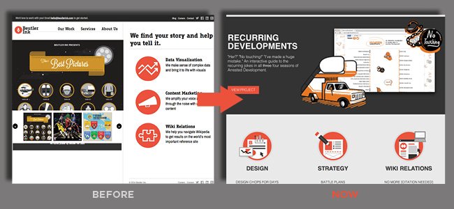
1. An amazing new design, built for winning:
If our previous website was a totally practical four-door sedan, our new site is a Ferrari—speedy, sexy, and outfitted to the nines. My god, it's beautiful...
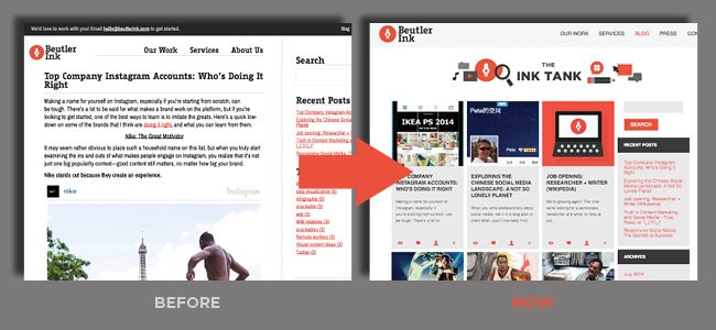
2. An awesome blog format that’s awesome for blogging:
From preview images to snippets of posts, the new blog gives you an easier way to see what we're talking about. Oh, and the blog has an all-new name: The Ink Tank. It's totally great, right, kitty?
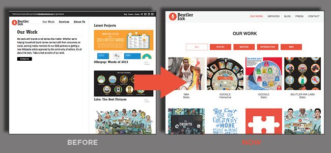
3. Portfolio—the coolest way to see our work
The new and improved "Our Work" section allows you to see the work we've done at a glance, as well as sort by type—static, motion, interactive, and wiki. That's right, we've also included case studies for our work on Wikipedia. Yeah, portfolio page. You rock!
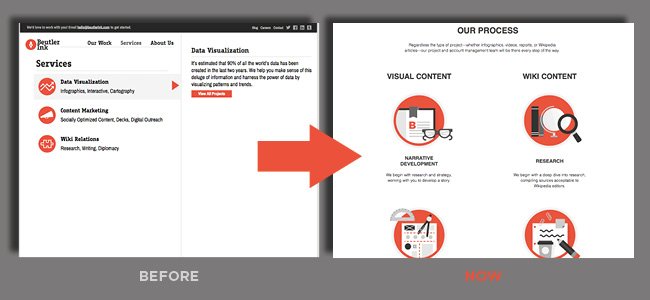
4. We do all of this totally cool stuff:
Whether it's Wikipedia or content, people often wonder how we work. Well, here's your answer—a revamped page that provides an overview of our processes. Don't you love all the cool stuff we do?
5. Check out where other people are talking about us:
An all-new page to the site, our "Press" page lets you see where our projects have press (spoiler: lots of awesome places). We're popular!
6: See the radical partners we work with
This is a new section, too, and lets you see some of the amazing brands that we're pleased to call partners, from Google to the U.S. Chamber of Commerce.
Slam. Dunk.
Seriously, though, we couldn't be more pleased with our new website, and we hope that you love it, too!


