Dose of Design: Branding & Identity
Beutler Ink's creative team is picking their favorite new designs in branding, data viz, and motion. Starting us off is Jay Doronio, a Beutler Ink art director who's worked on projects such as 50 Shades of Grey Quotes: Visualized and AdMob's Super Mario Bros Infographic. Today, however, he's starting us off with a dose of branding design.
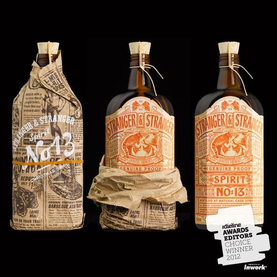
Stranger & Stranger
Don’t get me wrong, I love a dram of tasty scotchy, scotch. But wrap it in some lovely packaging that has solid typography, illustration, and color palette to boot, game over! I’ve been following Stranger & Stranger for several years now, and when I come across some fine spirits and/or beer that gets me turnt’ up visually, 9 times out of 10 it’s been designed by these guys—it would be so fun to do something like this. What I love about what S&S is doing is they're taking old design conventions, and applying modern design aesthetic that result in something that's very nostalgic, appropriately modern and just friggin' gorgeous!
Tidningshuset by Pontus by Bold, Sweden
Bold’s identity design for Tidningshuset by Pontus, is a fun example of drawing inspiration from your environment. Located in the building where Sweden’s largest newspaper, Dagen Nyheter, is headquartered, Tidningshuset by Pontus takes similar visual cues from its neighbor in its use of a blackletter masthead and continuous roll style in their printed collateral. But that salmon key-color though, woo!
Frost Collective: Manfredi
It’s starting to become apparent that two of my favorite things are good food and design. For for PizzAperta, Frost Collective did a great job in playing up the word ‘aperta’ which translates to ‘open’, in the overall ID design; a stencil-esque typeface with no closed spaces that can be broken apart to create a pattern that echoes pizza toppings. Simple, fun and visually tasty.


