4 Data Visualizations to Check Out from May
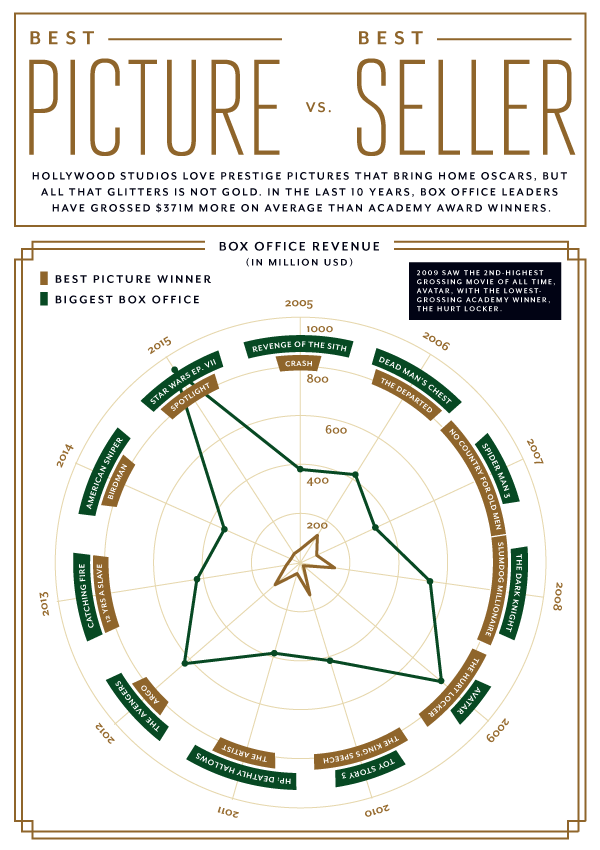
Can you believe it's already June? That means it's time for beaches, barbecues, and of course our look back at Thursdata in May! This weekly email newsletter is a data viz showcase, in which we take a look at the numbers behind the news. Politics, science, current events—all fair game for our visualizations. Click here to subscribe for free today! Without further ado, let's get into it:May 5: Hollywood loves Oscars, but does that hardware translate into hard cash?
We compared revenue for Best Picture winners and box office champs from the last 10 years:
May 12: Just over half (51.4%) of the entrepreneurs who appear on the show close deals with the sharks. We showed you which types of companies are most likely to secure funding.
May 19: We all know NBA salaries are through the roof. But just how efficient are those payrolls at generating wins? We take a look at the win efficiency of the 6 division winners.
May 26: Subscription box services have blown up over the last few years. In fact, their growth has dwarfed traditional online retail. We examine this trend and highlight some of the heavyweight champs.
Those were great, don’t you think? Get piping hot data visualizations like these served fresh to your inbox every Thursday—click below to subscribe!


